Ottawa International Animation Festival
I had the lovely opportunity to work with the Ottawa International Animation Festival(OIAF) for their 2017 production. During my contract I was responsible for designing and formatting the program guides, as well as building online advertisements, posters, festival passes, and visuals for the schedule application.
The visual theme of the festival was a bit tricky- in that the curated festival poster for 2017 didn’t contain a lot of isolatable visuals to tie in with the rest of the festivals visuals. As a result I used a lot of texture to establish consistent themes across the various mediums.
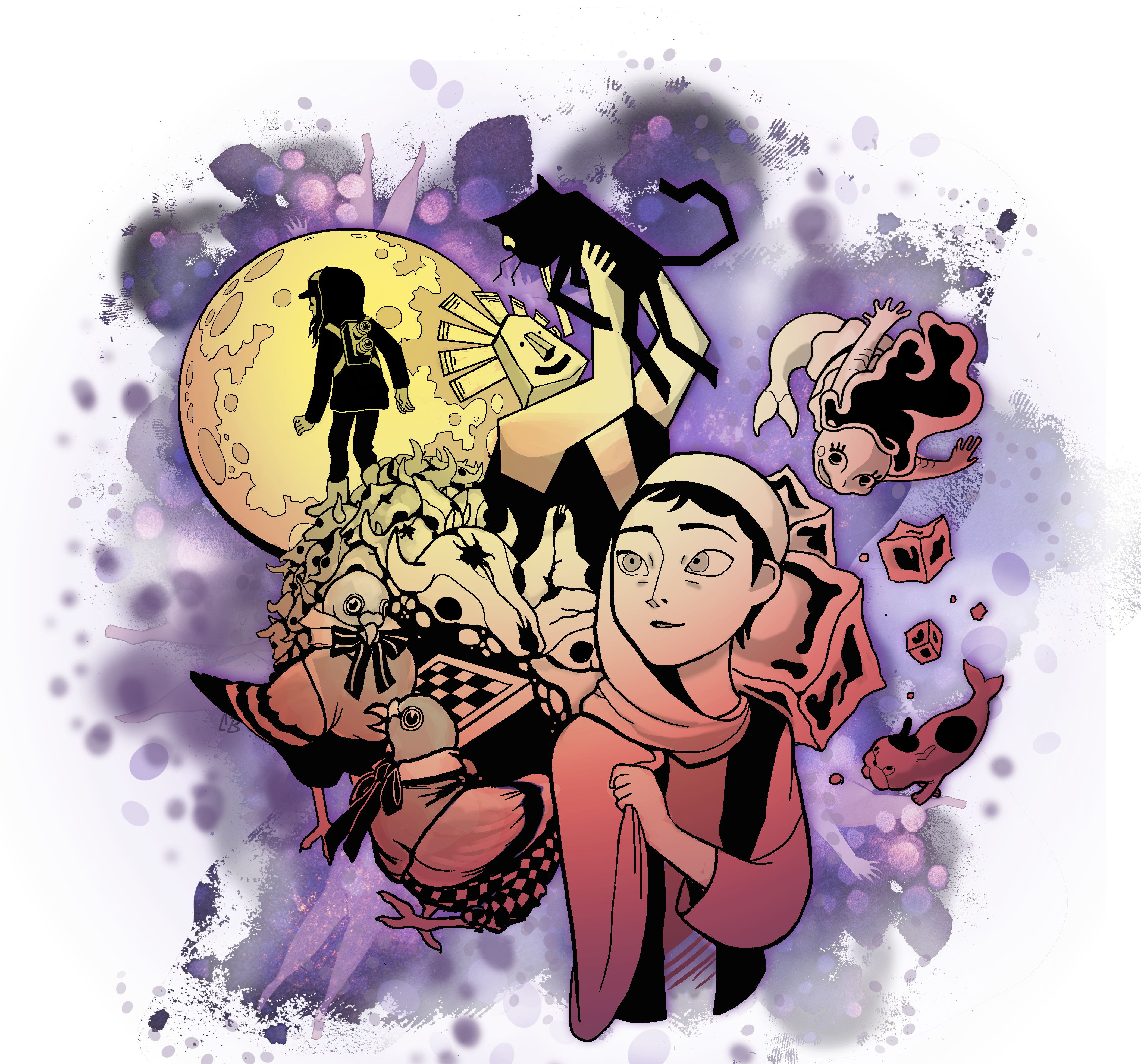
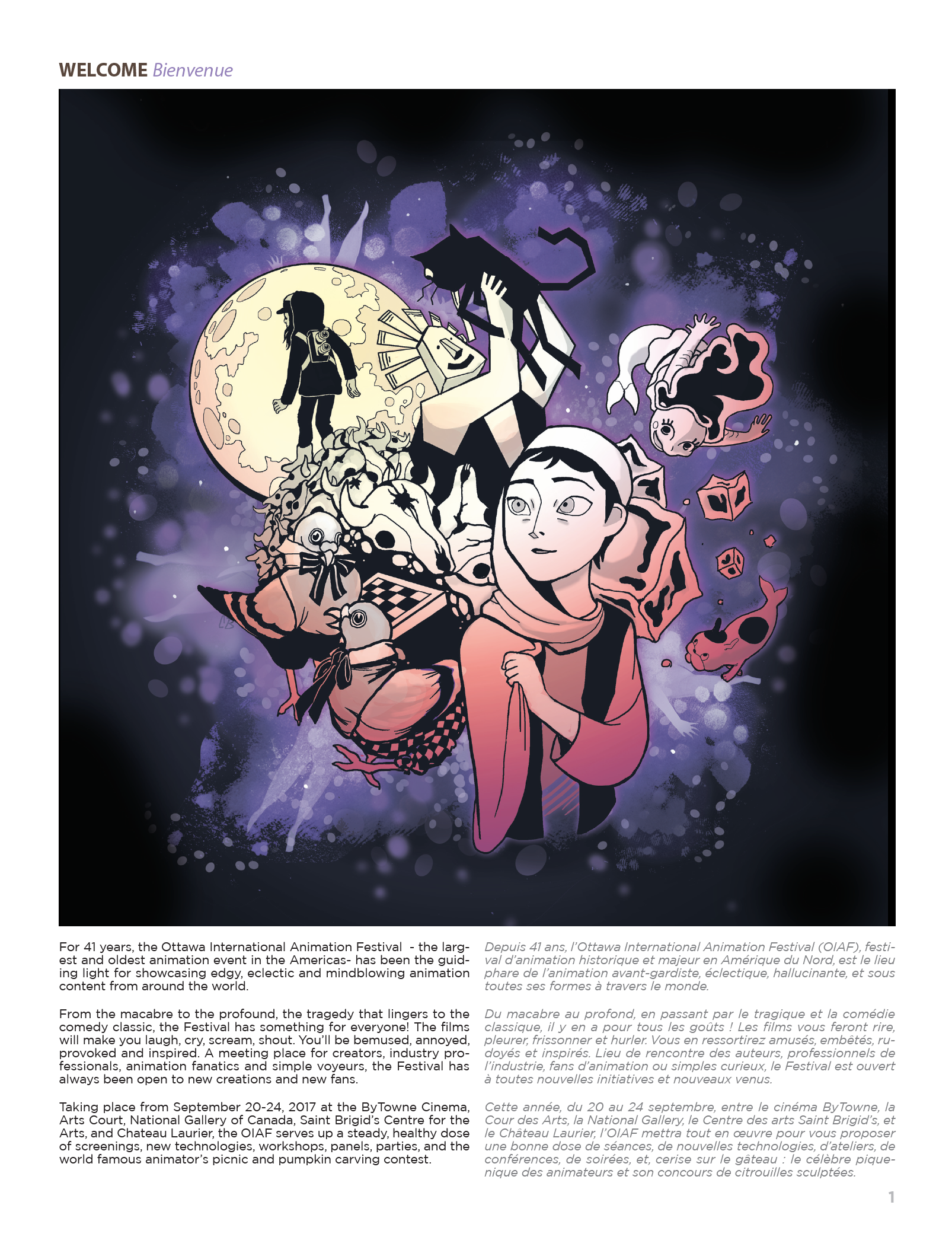
For areas where we lacked visual content, such as the festival program page (usually containing a campaign image that was missing this year) - I supplied an illustration featuring visuals from the festivals curated poster combined with characters from this years feature films. This gave the festival guide a fitting visual introduction to the festival.
I worked with SHAW and the OIAF to create an identity for the Ingenius youth program hosted at the NAC.
The logo was designed to evoke the educational nature of the event, by having the logo contain the image of a brain. Drawn in a manner similar to that of a childlike illustration, the smiling face and nods to cartoon animation gave the logo a fun and approachable feel without sacrificing legibility.
Festival Guide Highlight Pages
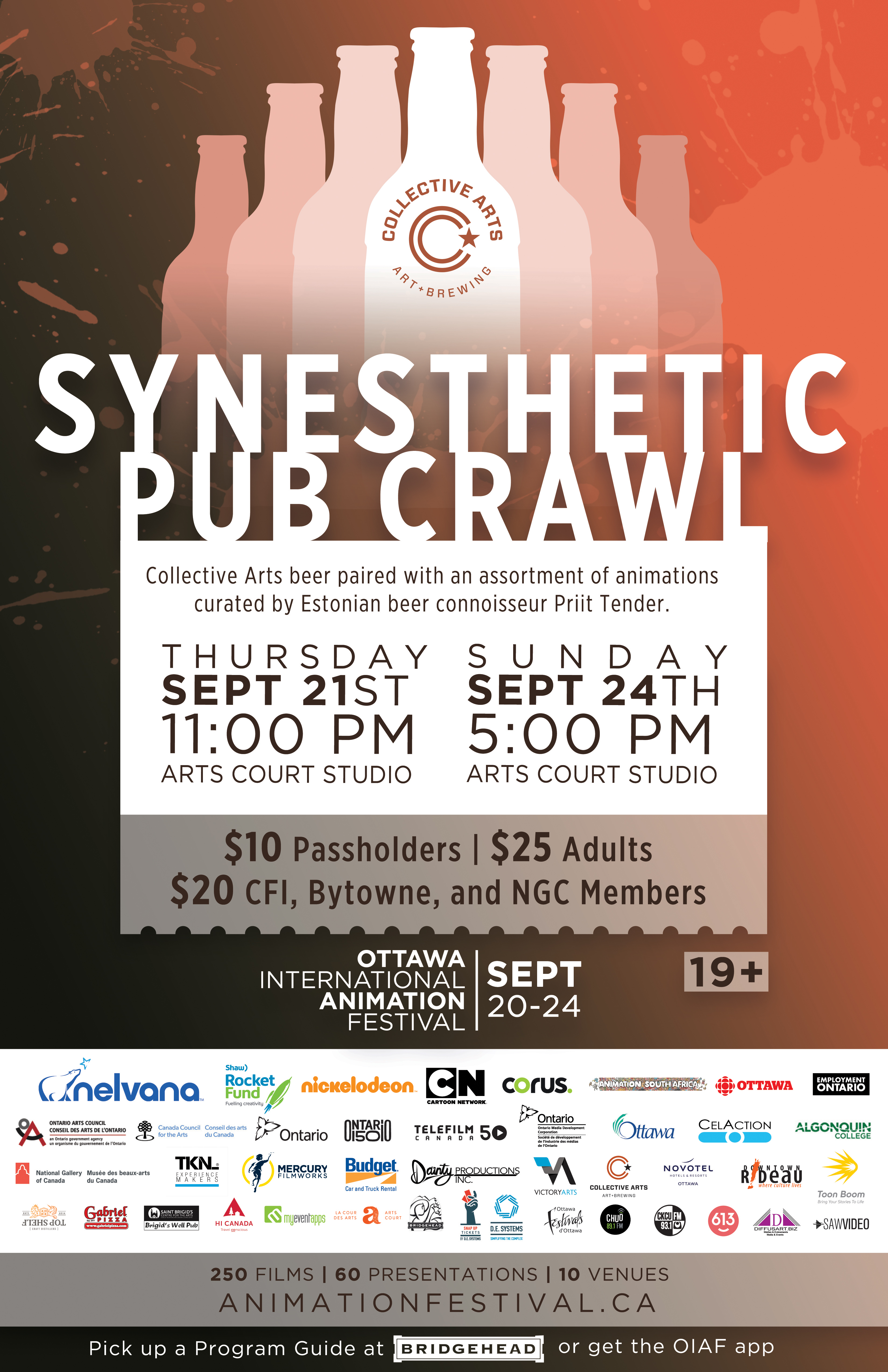
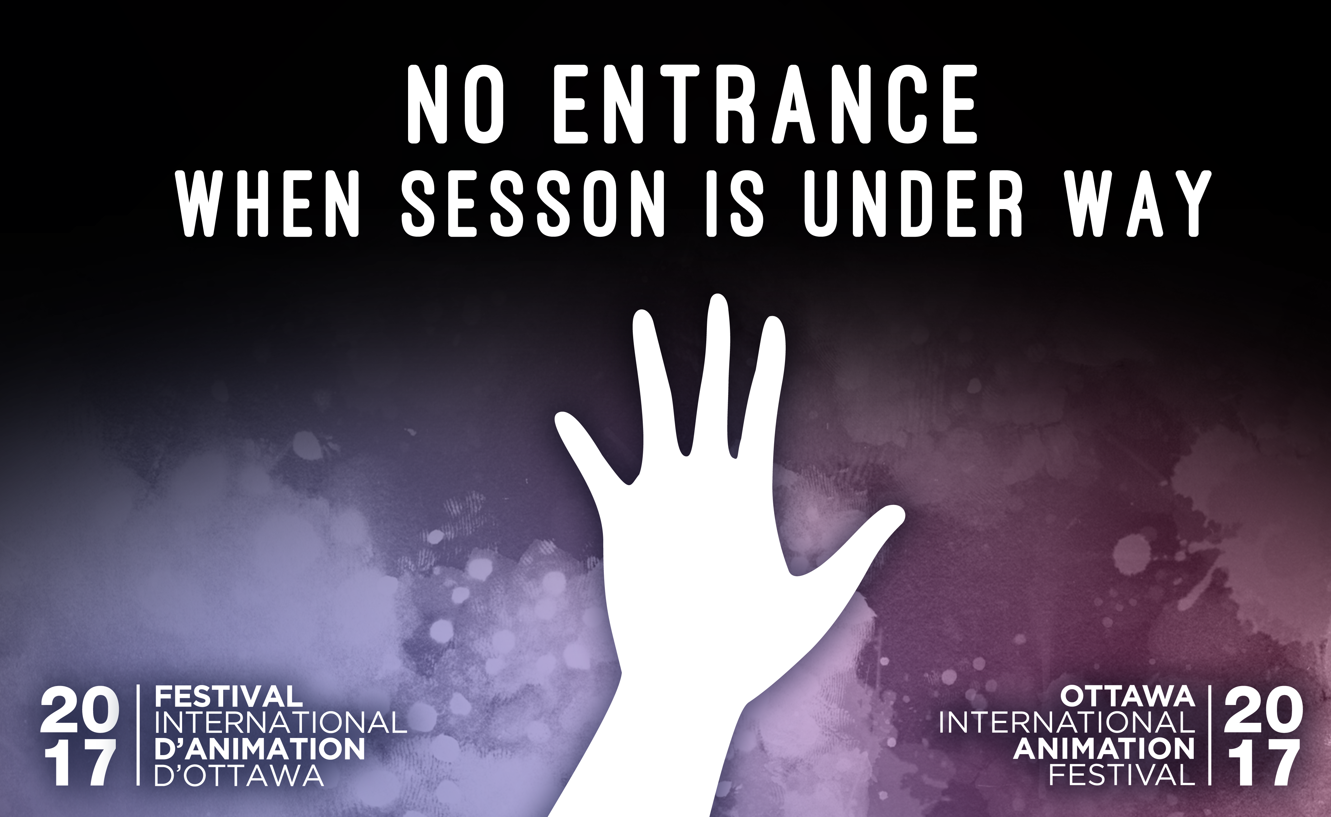
Directional Signage - Print
I created a variety of signage templates to aid festival goers in navigating various festival venues. I incorporated the theme of limbs to create a literal hand point theme to all the signs.
Problems and Solutions
Problem
The festival needed a fresh campaign for their posters and promotional materials for 2017. Previous campaigns were built on fun and playful Illustrated posters- but didn’t reflect the festival itself very strongly and potentially alienated locals. The festival needed a way to showcase individual screenings to a wider audience- while still identifying as part of the greater festival.
Solution
Rather than designing a separate campaign for the festival, I created a poster frame that could showcase the festivals featured screenings while establishing it as part of the festival. This design made it so the general public were more directly informed of local screenings, rather than having to recognise a general campaign and looking up the screenings online. Thus opening up the festival up to a wider audience of casual attendees. Overall I am happy to have been able to work with one of my favourite festivals, and glad to have created a wide variety of print and digital pieces.